30 Eylül 2012 Pazar

Poster Design


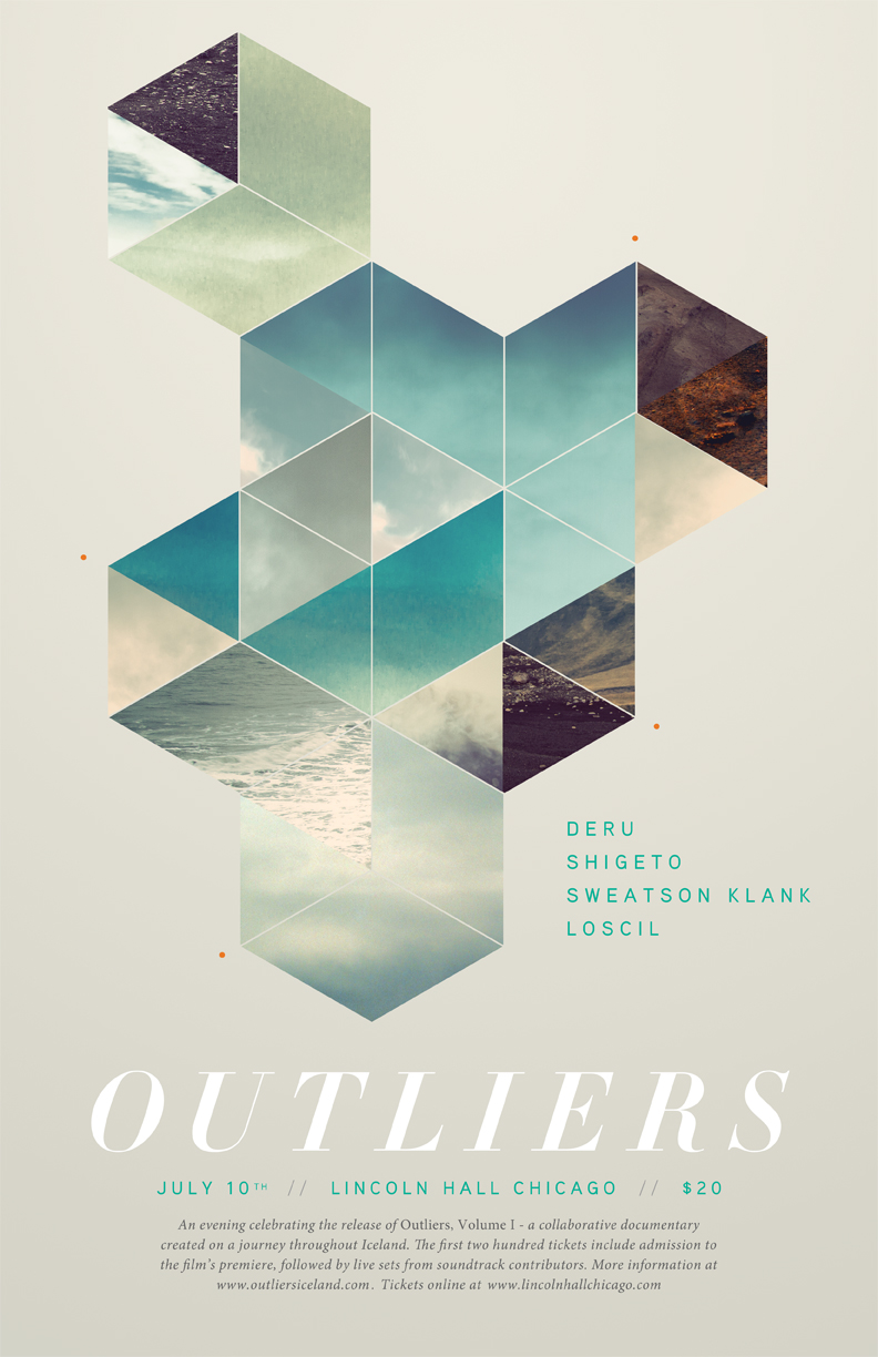
Some another poster design with a beautiful negative space. Just gives the information you need, with a subtle, breathing area.
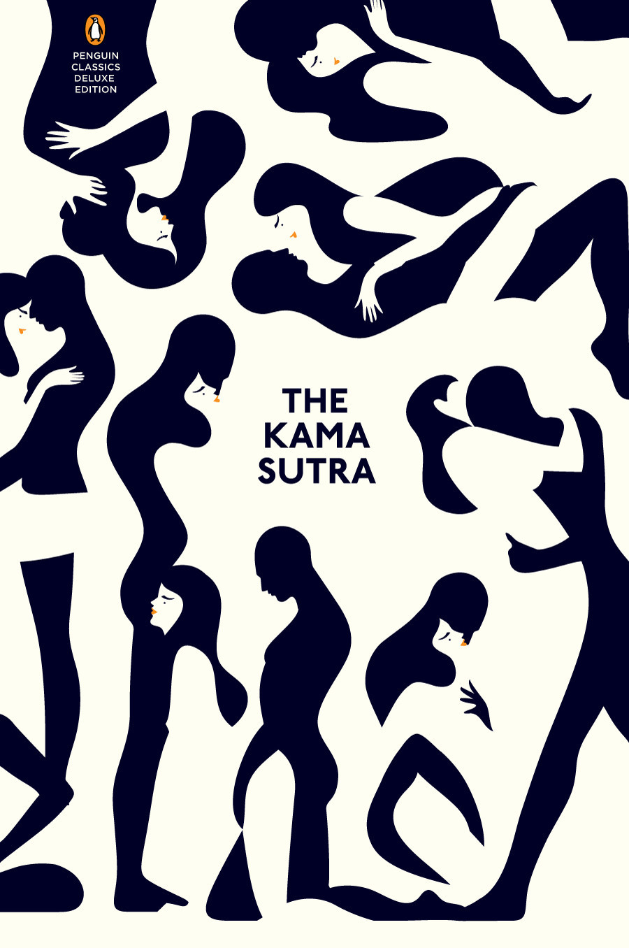
Center is safe. Your eyes automatically traces guidelines and reads the information that poster wants to give. On the other hand, I am a symmetry fan. Well I'll focus on this symmetry issue with some other examples later on.
Characteristics. Emphasizing the characteristics of an image is enough for us to imagine it?
Maybe by adding dimension, it becomes less virtual.

26 Eylül 2012 Çarşamba

Illustrations


Patrik Svensson, 

a creative artist from Stockholm, Sweden.

"I wish I could express how much pleasure I found in this project. It was pure joy to get the opportunity to collect a mixture of vibe based illustrations and visual tricks under one roof."
-Evan Varsamis


Modules

When I look at these works, I can't stop myself thinking about what would Turkish people think. Of course some firms will find it attractive but what about the majority.

Logo Design

Cut-it-Out
Wedding photographer
minimum

Cuben by Simon C Page


designed as iPad wallpaper by Simon C. I find them really fascinating and harmonic.